Campur²
Role
UX/UI Designer
Visual Designer
Duration
Apr 2021 - Jun 2021
Responsibilities
Conducted interviews, paper and digital wireframing, low and high-fidelity prototyping, Conducted usability studies, accounted for accessibility, and iterated on designs.
Created logo, visual language, and merchandise mockups.
The Product
Campur² is a local food truck in Seattle, WA that serves authentic Indonesian food. The team strives to deliver their love of Indonesian food to people who miss the taste of home, adventurous people who look for new experiences, as well as busy individuals who need to order their meal ahead of time. Nasi campur means mix rice and is an embodiment of the melting pot of different cultures in Indonesia. Customers can choose the dishes based on their taste and dietary preferences, which is a unique attribute of Campur².
The Problem
Busy workers and commuters lack the time necessary to grab food during their lunch break.
The Goal
Build Campur² food truck app to help customers browse menu, order food, and pay ahead of time, so they can skip lines and avoid long wait times.
User Research Summary
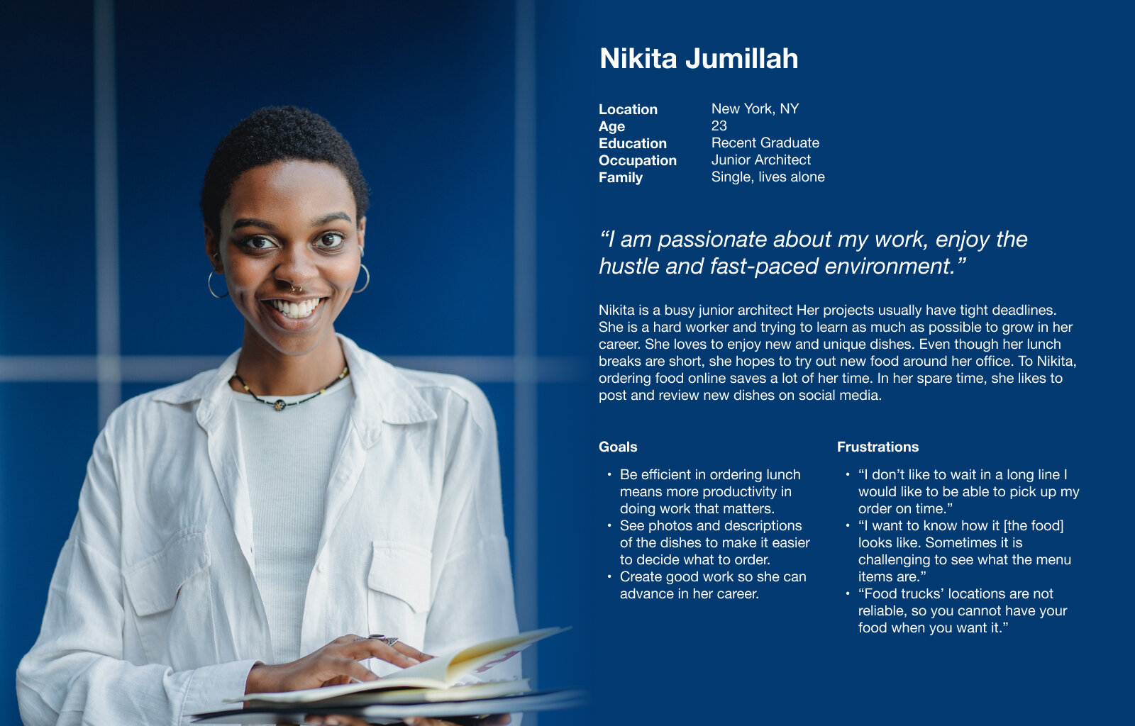
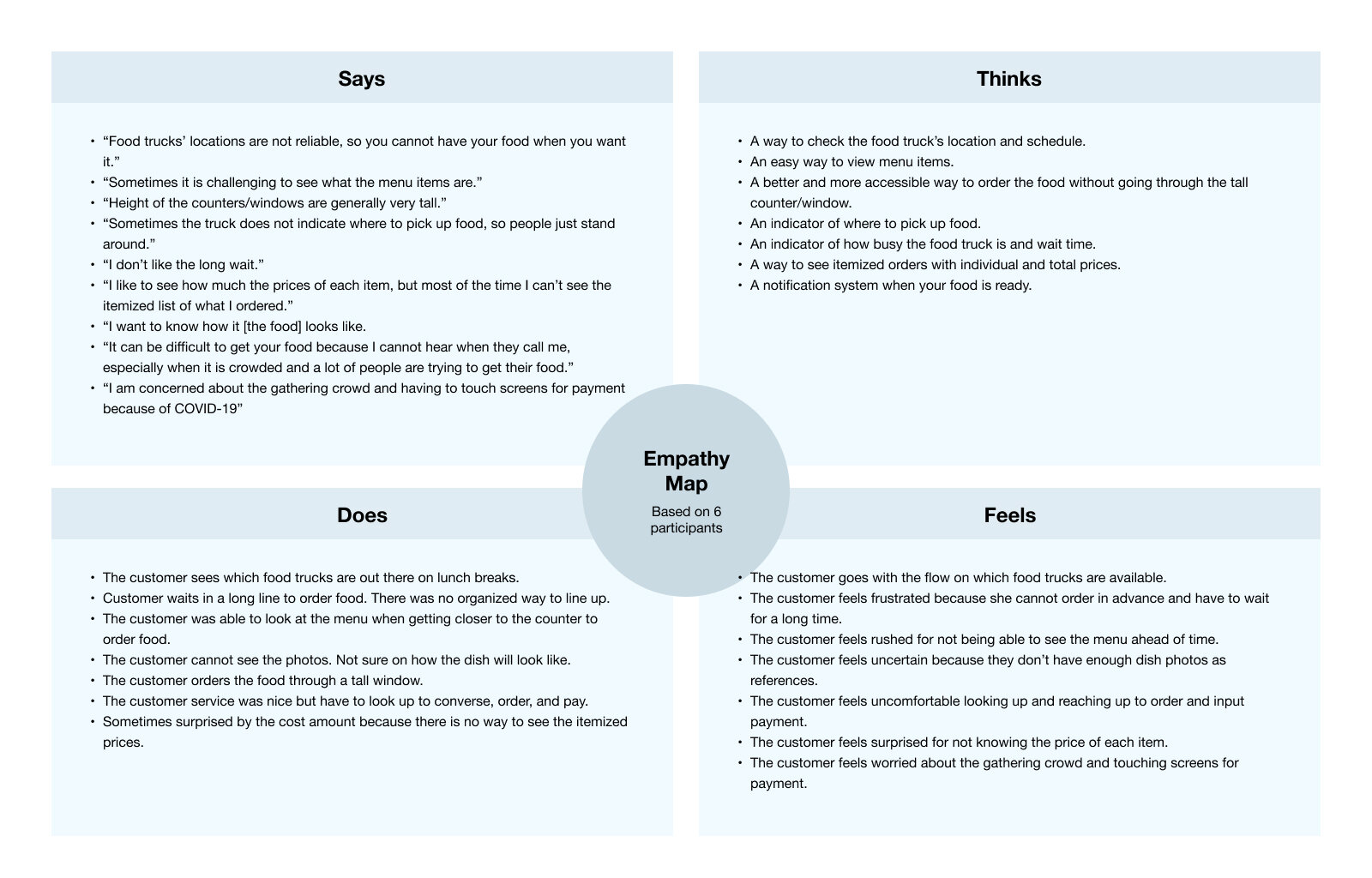
I conducted interviews and created empathy maps to understand the users I’m designing for and their needs. A primary user group identified through research was working adults who have little time to get meals during their busy schedules.
Research revealed that time was not the only factor limiting users from ordering food. They are also interested in being able to browse the menu at ease with flexibility in customizing their food preferences.
Time
Busy workers and commuters lack the time necessary to grab food during their lunch break
Browse
Users want to browse the menu conveniently with necessary images and information
Itemized Order
Users want line by line, itemized order for transparency
Pick up
Users want a way to locate the food truck and know when to pick up their order


Paper Wireframes
Taking the time to draft iterations of each screen of the app on paper ensured that the elements that made it to digital wireframes would be well-suited to address user pain points. For the home screen, I prioritized a quick and easy ordering process to help users save time.
Digital Wireframes
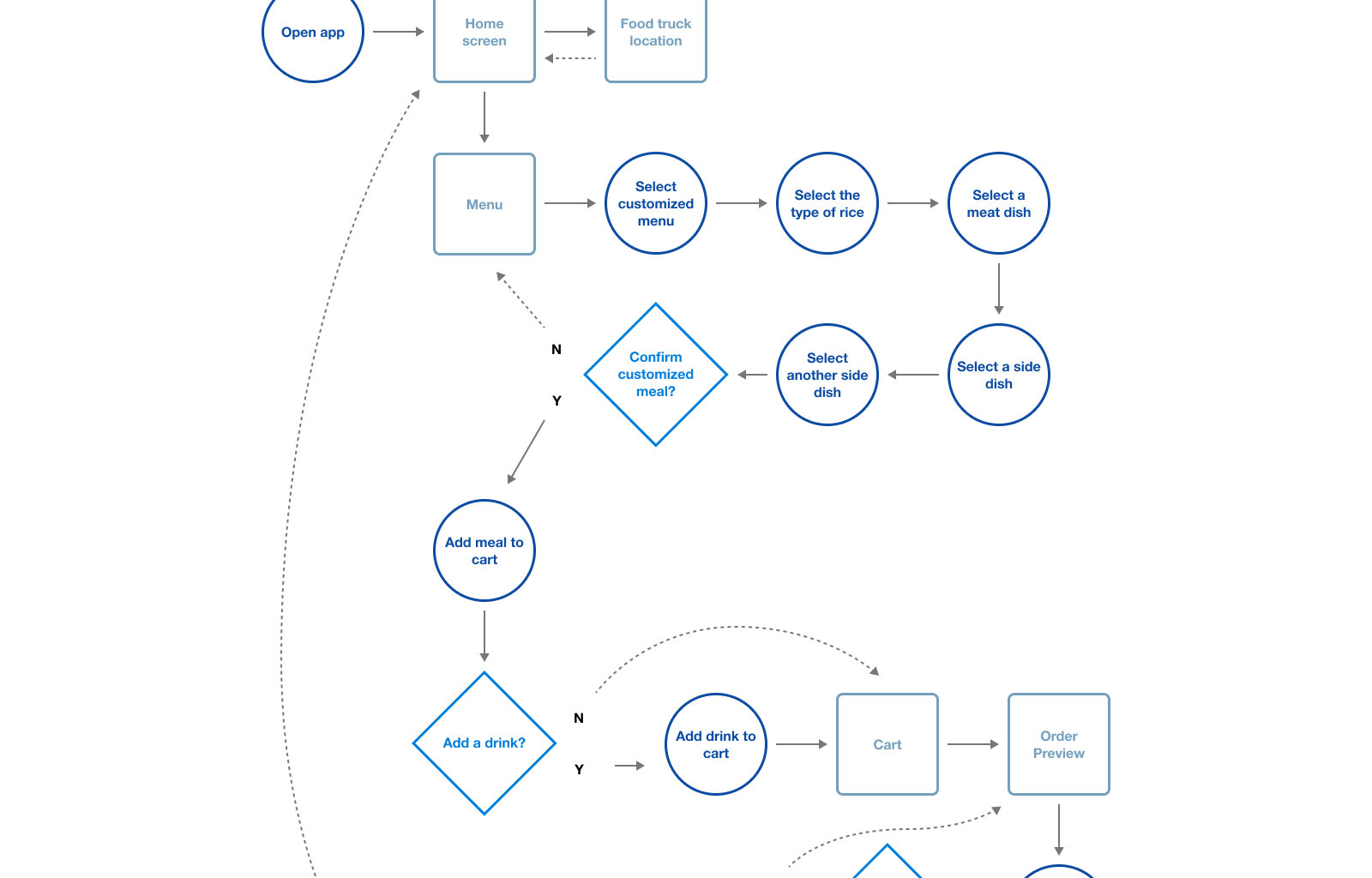
Using the completed set of digital wireframes, I created a low-fidelity prototype. The primary user flow was to complete a customized order, so the prototype could be used in a usability study.
View the Campur² low-fidelity prototype.
Usability Study and Refining the Design
I conducted two rounds of usability studies. Findings from the first study helped guide the designs from wireframes to mockups. The second study used a high-fidelity prototype and revealed what aspects of the mockups needed refining.
The final high-fidelity prototype presented cleaner user flows for completing an order and checkout. It also met user needs for a pickup option as well as more customization. I made sure that the color combinations pass the accessibility color contrast, used icons to help make navigation easier, and used detail imagery for the menu and side dishes to help all users better understand the designs.
View the Campur² high-fidelity prototype.
Visual Language
I created a simple logo that can withstand time and can last for generations to come; a logo that connects old traditions and modern cultures. In math, the squared symbol is an arithmetic operator that signifies multiplying a number by itself. In Indonesian, some words are repeated to create a new meaning or to emphasize the word itself. Campur² (Campur-campur) is a perfect example of this. Younger generations usually use the squared symbol as slang. The red color in a rectangle shape is added to emphasize and give balance to the squared symbol. The color palette of red and white is taken from the Indonesian flag color.
I expanded the design to some merchandise items. These items can be used as the staff uniform, to sell, or as marketing giveaways.

Thank you for checking out my case study!
Visit the full case study
Let’s connect! jessica.andriany@gmail.com


